02 / PROJECTBack to work ↗

GEAR6

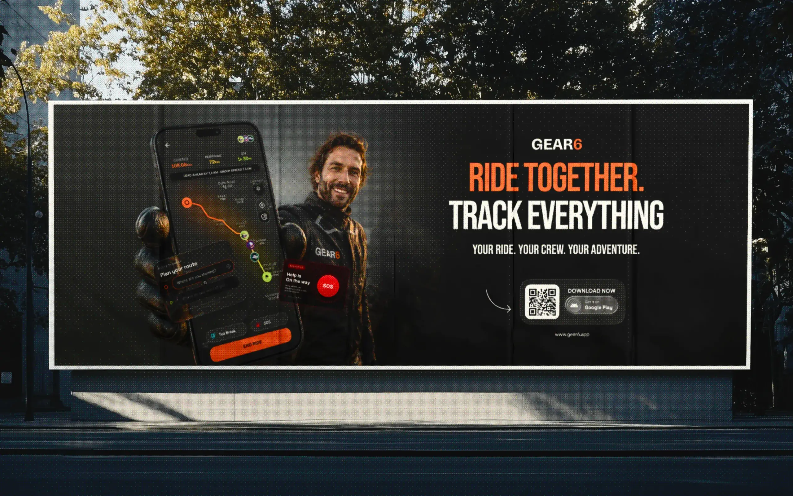
Designing a smarter way for motorcyclists to discover rides, connect with riders, plan routes and stay connected on the road.

ROLE
Product Design · UX Strategy · UI Design
YEAR
2026
CLIENT
GEAR6
PLATFORM
iOS · Android · Web
STATUS
 Live

THE PREMISE

The road is better with people.

Motorcycling has always been about more than getting from one place to another. It is about the people you meet, the routes you discover, and the experiences you share along the way. But organizing a group ride often means switching between messaging apps, maps, social platforms, and separate riding tools. Gear6 brings those fragmented experiences together into one focused platform where riders can discover upcoming rides, connect with fellow motorcyclists, plan routes, join communities, and stay connected with their crew throughout the journey.

One connected experience—from discovering a ride to riding together.© Raman
03core ride modes
42Product screens designed
01Connected rider ecosystem

A system that disappears at speed.

01

Listen

Understand how riders discover trips, organize groups, communicate, navigate, and stay connected before, during, and after a ride.

02

Reduce

Turn a complex ecosystem of maps, communities, invitations, profiles, tracking, and ride controls into simple and predictable user journeys.

03

Test

Refine critical flows, interactions, ride states, and edge cases until the experience feels clear, fast, and effortless across the entire journey.

A high-contrast visual system built around Gear6’s signature orange—bold enough to feel distinctive, restrained enough to keep the product focused.© Raman

VISUAL SYSTEM

Built for the energy of the road.

The Gear6 visual language was designed to feel bold, focused, and unmistakably connected to motorcycle culture without relying on familiar biker clichés. A near-black foundation keeps the interface immersive, while Gear6 Orange creates a clear visual signature across primary actions, active ride states, and key moments of interaction. White and carefully balanced neutrals establish hierarchy and keep information easy to scan. The result is a consistent design system that gives Gear6 its own identity while remaining functional across ride discovery, maps, communities, rider profiles, and real-time riding experiences.

Technology should connect the ride, not compete with it.
Next project / 02

Jodly